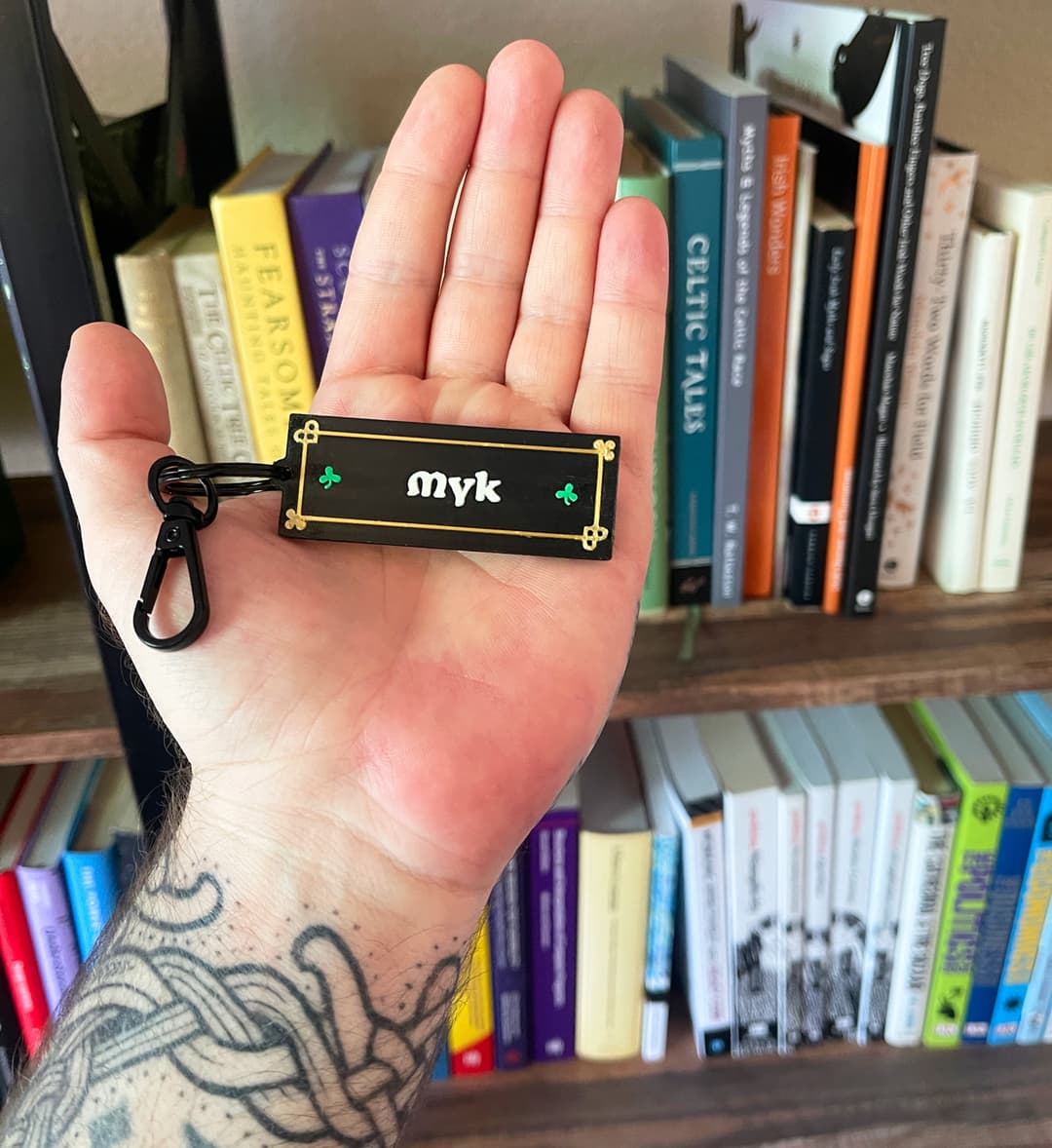
The keychain design has four colors and a lot of fine detail: a gold Celtic knot border, small green shamrocks, white text, all on a black matte base. On the first batch, the larger shapes like the shamrocks and text came out fine, but the thin gold border elements had visible bleed where the gold met the black. Some prints were better than others, but the best ones still had room for improvement.
Here's what I changed and why each setting matters.
Lower the filament temperature
This made the biggest difference. Hotter filament is more fluid, so it spreads more at color boundaries and strings between travel moves. You want it just hot enough to adhere, not so hot that it oozes into the next color. Moisture in the filament can cause stringing too, but that wasn't the issue here.
I created a "Crisp Details" filament preset for each color which I can use in Bambu Studio:
- White PLA (Sunlu): dropped from 220°C to 210°C
- Gold Silk PLA (Sunlu): dropped from 230°C to 220°C
- Black Matte PLA: left at default (less critical since it's the base layer)
Silk filaments need more heat than standard PLA to flow well, so I didn't drop the gold as far. Start with a 10°C reduction from your normal temp and adjust from there. Check your filament vendor's recommended range too.
Reducing the line width
The default line width for a 0.4mm nozzle is usually 0.42-0.45mm. For detailed multicolor work, narrower lines give you sharper edges.
I set these to 0.35mm which seems to be around the smallest setting to prevent squiggly lines from the filament being too thin:
- Default
- Initial layer
- Outer wall
- Inner wall
- Top surface
Sparse infill and internal solid infill stayed at their defaults (0.45mm and 0.42mm) since they're not visible and not applicable to the objects since they were thin.
The trade-off is slightly longer print times since the slicer needs more passes to fill the same area. For small parts like keychains, it doesn't add that much more time.
Slow down outer walls and top surfaces
The faster the extruder moves, the less precisely it places filament. Slowing down the visible surfaces where colors meet gives you cleaner boundaries.
I adjusted from the 0.12mm High Quality base profile:
- Outer wall: 60 mm/s (the default in the .12mm high-quality profile)
- Top surface: dropped from 150 to 100 mm/s
- Inner wall: dropped from 150 to 100 mm/s
The top surface speed matters most for keychains since the design is on the top face. If you're printing something where the side walls are the detailed surface, prioritize outer wall speed instead.
Use thinner layers
I switched from 0.2mm to 0.12mm layer height using the "0.12mm High Quality" preset in Bambu Studio as my starting point. Thinner layers mean:
- Finer vertical resolution on any raised or recessed details
- Less material per layer, which reduces spreading at color boundaries
- Smoother top surfaces, especially with ironing enabled
The 0.12mm preset also enables ironing, which does a second pass over top surfaces at low flow to smooth them out. This helps a lot with text legibility.
Tune retraction for stringing
If you're seeing thin wisps of filament between color regions or around small details, that's stringing. The fix is retraction settings, which control how much filament gets pulled back when the nozzle travels.
For my Sunlu filaments, I adjusted:
- Retraction length: 0.8mm (default was 0.8mm, so this was already good)
- Retraction speed: 30 mm/s (default)
If you're still seeing stringing after the temperature drop, try increasing retraction length to 1.0mm in small increments. The temperature drop usually handles most of it on its own.
The Illustrator trick: path offset for thin details
Even with perfect print settings, a 0.4mm nozzle can only print details so thin. If your font or illustration has strokes narrower than 0.4mm, the slicer either skips them or tries to print them as a single blobby line. You'll see it in the slicer preview: letters not connecting, or parts of the design missing entirely.
The fix is to add a path offset in Illustrator before exporting your SVG:
- Select the thin paths (text outlines, border details, etc.)
- Go to Object → Path → Offset Path (after converting text to outlines in the same menu)
- Add a small positive offset (start with 0.1-0.2mm) to thicken the paths
- Check the preview; you want the detail to be at least 0.5mm wide at its narrowest point so the slicer can lay down a clean line
This is especially useful for Celtic fonts where letters have thin serifs or decorative hairlines. The offset fattens them just enough to print cleanly without changing the overall look of the design.
If you're working in Inkscape instead, the equivalent is Path → Dynamic Offset or Path → Outset.
The full "Crisp Details" profile
Here's a summary of everything I changed from the 0.12mm High Quality base profile on a Bambu A1:
Process settings:
- Layer height: 0.12mm
- Line width (walls, top surface): 0.35mm
- Outer wall speed: 60 mm/s
- Inner wall speed: 100 mm/s
- Top surface speed: 100 mm/s
- Ironing: enabled
Filament settings (per material):
- White PLA: 210°C
- Gold Silk PLA: 220°C
- Retraction: 0.8mm length, 30 mm/s speed
Save these as a custom process preset ("0.12mm High Quality – Crisp Details") and filament presets ("Sunlu White – Crisp Details," etc.) so you can reuse them on any multicolor print where detail matters.
When to use this vs. the standard profile
This profile is slower. For large single-color prints or functional parts where surface detail doesn't matter, stick with the standard 0.2mm profile at full speed. Use crisp details when:
- You're printing multicolor designs with fine boundaries
- Text or logos need to be legible at small sizes
- Decorative details like borders or filigree are part of the design
- You're printing something to sell or gift and want it to look its best
The result: Celtic name keychains
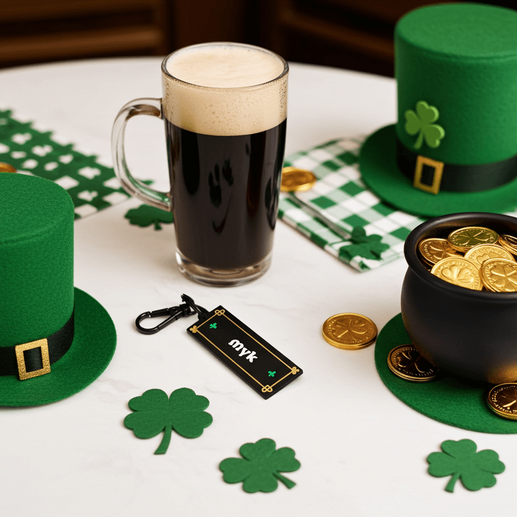
The settings in this post were dialed in while printing personalized Celtic name keychains for St. Patrick's Day. The design is inspired by the Book of Kells, with a black matte base, gold silk border, green shamrocks, and your name in white Celtic lettering. Four colors, fine details, and exactly the kind of print where these settings make a visible difference.
If you want one, they're available on our Etsy shop or the Maker Pub shop.